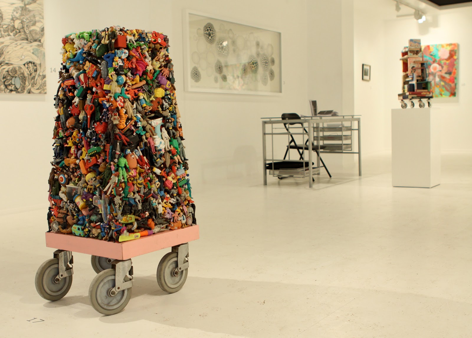
"Chisnall creates art that references such things as structure, time and Modernism as they pass through a very contemporary mindset that focuses on humor, transience, functionality and futility.” D. Dominick Lambardi, 'Repurposing With a Passion', The Huffington Post.
Thursday, 24 November 2011
Tattoos and Toys
I'm pleased to announce that I've been invited to exhibit my toy tower sculpture, Magnet, in the new Urban Curations exhibition. The show is curated by Infinity Bunce in conjunction with Triple X Tattoo.
Unfortunately I won't be able to make it to the opening night on Saturday 3rd December as I'll still be in Miami for Art Basil but do feel free to pop along if you happen to be in the area.
The venue is Netil House, Studio 206, 1-7 Westgate Street, London E8 3RL, England.
Saturday, 19 November 2011
RCA Secret Artists' Party 2011
Last night saw the RCA Secret's eighteenth birthday launched with a party and Champagne reception, as a thank you to all the artists that have supported the project.
As usual the show is held in the Royal College of Art's Gulbenkian Galleries in Kensington Gore, London SW7 2EU and the same rules apply. The original postcard-sized artworks produced by internationally acclaimed artists and up-and-coming graduates from the RCA will be on display for a week before going on sale to the public.
The 'secret' part of the show is that the cards are only signed on the reverse, keeping the artwork's author a mystery (although I know a few dedicated RCA Secret fans who usually work out pretty much who's produced what) up until the point that the card is purchased. Each card is priced at £45 and a maximum of for cards may be purchased per person but if you fancy joining the queue I suggest you get there early as I already saw one person camped out last night (a week ahead of the opening). Oh yes – and you'll have to register first.
If you can't make it to the show before the opening fear not as you can view this year's cards online.
As per usual, I've submitted three separate cards under both of my names,' Wayne Chisnall' and 'Chig'. Is that wrong? - I think not. There are no prizes this year for guessing which ones are mine as I think that most of them are pretty obvious. But do feel free to drop me a line if think you've worked them out and want to assess you powers of deduction.
Here's a photo of me at the party with the photographer, Rosie Mayell, obviously enjoying the Champagne a bit too much.
Unfortunately I won't be able to make it to the opening of this year's show on Saturday 26th of this month as I'll be jetting off to Miami for the opening of Art Basel. I'm looking forward to a few days of driving round the Florida Keys in a convertible (and possibly doing a spot of alligator wrestling) before hitting the fair for arty brunches, parties and exhibitions. I've already packed my best Don Johnson/Miami Vice outfit (circa 1984).
As usual the show is held in the Royal College of Art's Gulbenkian Galleries in Kensington Gore, London SW7 2EU and the same rules apply. The original postcard-sized artworks produced by internationally acclaimed artists and up-and-coming graduates from the RCA will be on display for a week before going on sale to the public.
The 'secret' part of the show is that the cards are only signed on the reverse, keeping the artwork's author a mystery (although I know a few dedicated RCA Secret fans who usually work out pretty much who's produced what) up until the point that the card is purchased. Each card is priced at £45 and a maximum of for cards may be purchased per person but if you fancy joining the queue I suggest you get there early as I already saw one person camped out last night (a week ahead of the opening). Oh yes – and you'll have to register first.
If you can't make it to the show before the opening fear not as you can view this year's cards online.
As per usual, I've submitted three separate cards under both of my names,' Wayne Chisnall' and 'Chig'. Is that wrong? - I think not. There are no prizes this year for guessing which ones are mine as I think that most of them are pretty obvious. But do feel free to drop me a line if think you've worked them out and want to assess you powers of deduction.
Here's a photo of me at the party with the photographer, Rosie Mayell, obviously enjoying the Champagne a bit too much.
Unfortunately I won't be able to make it to the opening of this year's show on Saturday 26th of this month as I'll be jetting off to Miami for the opening of Art Basel. I'm looking forward to a few days of driving round the Florida Keys in a convertible (and possibly doing a spot of alligator wrestling) before hitting the fair for arty brunches, parties and exhibitions. I've already packed my best Don Johnson/Miami Vice outfit (circa 1984).
Tuesday, 8 November 2011
Nail Box in Art and Auction Magazine
My Nail Box sculpture is due to be featured in the December issue of Art and Auction magazine as part of an ad campaign for the New York-based art storage and transportation company, Crozier Fine Arts, who are the global art logistics partner for Ai Weiwei's 'Circle of Animals/Zodiac Heads'.
Photo by Rosie Mayell.
Sunday, 30 October 2011
My Work on The Culture Show
Here's a six and a half minute item by Michael Smith, investigating the cultural highlights of Birmingham. It appeared in Friday night's edition of The Culture Show on BBC 2 and briefly features (almost 2 minutes into the item - for those of an impatient disposition) my sculpture, The City, which was on show at the Creative Machines, Minimalist Sculptures exhibition at the old Curzon Street Station, as part of Birminhgam's The Event 2011.
Alternatively, you can click on this Culture Show link which will take you direct to the relevant page of the BBC website.
Thursday, 27 October 2011
RCA Secret Blog Interview
Well it’s that time of year again and the RCA Secret postcard show is almost upon us. It seems to come round faster every year and as usual I only just made the deadline for getting my cards into the show. This year, because of other mounting arty-farty commitments, I left things a bit late and was working on my six entries (three cards as Wayne Chisnall and three as Chig, the name I used to illustrate under and the one I'm more commonly known by back home) up until 3AM the night before the last handing-in day.
For anyone that fancies finding out what I and a few of the other regular contributors the RCA Secret think about the show please feel free to check out our interviews on the RCA Secret blog.
Here are a couple of my entries from last year’s RCA Secret show.
This one, Werecrow, under the name Chig…
And this one as Wayne Chisnall.
For anyone that fancies finding out what I and a few of the other regular contributors the RCA Secret think about the show please feel free to check out our interviews on the RCA Secret blog.
Here are a couple of my entries from last year’s RCA Secret show.
This one, Werecrow, under the name Chig…
And this one as Wayne Chisnall.
Wednesday, 26 October 2011
The Event at Curzon Street Station, Birmingham
The launch night of The Event 2011 went off fantastically and I would definitely recommend that anyone who finds themselves in Birmingham between now and the 30th of this month should pop along to see it. And I’m not just saying that because I have a piece in the show. Even if you are not that interested in art (of which there are some great examples in the exhibition – I particularly liked the MDF sculptures) it is definitely worth going just to check out the time capsule that is the old Curzon Street Station – an old railway station building that is very rarely opened up to the public.
Up until I got off the train at Moor Street and headed for the show I didn’t know anything about the venue but once I saw it I was mightily impressed. Curzon Street Station is a haunting looking cube of a building standing alone in a waste land (the surrounding land presumably having been cleared to make way for new developments). If you do manage to make it to the show then check out the mummified cat set into the wall of the main entrance. Apparently if was discovered by builders whilst they were doing some renovation work and is thought to have been deliberately bricked up in the walls when the building was first built. Some sort of superstitious/good luck thing I believe.
Here’s picture of me tinkering with my sculpture, The City (photo courtesy of Rosie Mayell).
TROVE: THE EVENT 2011
21 – 30 October 2011
Launch Night – Fri 21st (5-9pm)
Curzon Street Station,
corner of Curzon Street and New Canal Street
(opposite Millenium Point),
Birmingham B4 7XG
UK
(Nearest train station: Moor Street Station)
Up until I got off the train at Moor Street and headed for the show I didn’t know anything about the venue but once I saw it I was mightily impressed. Curzon Street Station is a haunting looking cube of a building standing alone in a waste land (the surrounding land presumably having been cleared to make way for new developments). If you do manage to make it to the show then check out the mummified cat set into the wall of the main entrance. Apparently if was discovered by builders whilst they were doing some renovation work and is thought to have been deliberately bricked up in the walls when the building was first built. Some sort of superstitious/good luck thing I believe.
Here’s picture of me tinkering with my sculpture, The City (photo courtesy of Rosie Mayell).
TROVE: THE EVENT 2011
21 – 30 October 2011
Launch Night – Fri 21st (5-9pm)
Curzon Street Station,
corner of Curzon Street and New Canal Street
(opposite Millenium Point),
Birmingham B4 7XG
UK
(Nearest train station: Moor Street Station)
Tuesday, 25 October 2011
DOMUS
If any of you have walked along Great Sutton Street in Clerkenwell, London recently there’s a fair chance that you will have seen what I’ve been up to on the side of a 35 metre long hoarding. No, I’ve not decided to try my hand at being a street artist (I’ll leave that other, more stealthy characters) – instead I’ve been commissioned by Domus to decorate the hoarding that currently covers the front of their new and soon to be completed showroom.
Domus is the leading UK supplier and specification advisers of tile, mosaic and stone solutions for commercial and residential projects and as well as displaying a massive selection of their fine wares the new showroom will also incorporate a large gallery space for the exhibition of artwork. As well as designing and painting the hoarding (with a lot of help from fellow artists and friends, Sam Frith, Lola Gunn, David Kong and others) for Domus and have also been asked me to curate the exhibition space once it opens.
To coincide with the opening of the new showroom and because their main clients tend to be architects, Domus have commissioned artist, Jessica Walters, to create thirty 45cm tall miniature sculptures based upon the small figures that populate architectural models. These figures (all modelled on Domus employees) are being positioned in public spaces around the city and three of them can already be found high up on the wall of the building opposite the showroom, nestling in some old fireplaces that were exposed during the WWII bombings.
To see the work in progress for both the building site and the hoarding check out Steve Charles’ photos.
Domus is the leading UK supplier and specification advisers of tile, mosaic and stone solutions for commercial and residential projects and as well as displaying a massive selection of their fine wares the new showroom will also incorporate a large gallery space for the exhibition of artwork. As well as designing and painting the hoarding (with a lot of help from fellow artists and friends, Sam Frith, Lola Gunn, David Kong and others) for Domus and have also been asked me to curate the exhibition space once it opens.
To coincide with the opening of the new showroom and because their main clients tend to be architects, Domus have commissioned artist, Jessica Walters, to create thirty 45cm tall miniature sculptures based upon the small figures that populate architectural models. These figures (all modelled on Domus employees) are being positioned in public spaces around the city and three of them can already be found high up on the wall of the building opposite the showroom, nestling in some old fireplaces that were exposed during the WWII bombings.
To see the work in progress for both the building site and the hoarding check out Steve Charles’ photos.
Monday, 17 October 2011
Launch Party – This Friday
This Friday will see the launch of The Event 2011 at Curzon Street Station, Curzon Street, Birmingham. I’ll be exhibiting my sculpture, The City (see the post below) and will be at the show from 5pm when it opens. If you are in the mood for checking out some art that night and in the area then please feel free to pop along and join me.
TROVE: THE EVENT 2011
21 – 30 October 2011
Launch Night – Fri 21st (5-9pm)
Curzon Street Station,
corner of Curzon Street and New Canal Street
(opposite Millenium Point),
Birmingham B4 7XG
UK
(Nearest train station: Moor Street Station)
Artists include: Wayne Chisnall, Stephen Cornford, Jamie Jackson, Markus Kayser, Rob Mullender, Alex Pearl, Ben Rowe, Martin Sexton, Laura Skinner, Minnie Weisz, Luke Williams and Adam Zoltowski
TROVE: THE EVENT 2011
21 – 30 October 2011
Launch Night – Fri 21st (5-9pm)
Curzon Street Station,
corner of Curzon Street and New Canal Street
(opposite Millenium Point),
Birmingham B4 7XG
UK
(Nearest train station: Moor Street Station)
Artists include: Wayne Chisnall, Stephen Cornford, Jamie Jackson, Markus Kayser, Rob Mullender, Alex Pearl, Ben Rowe, Martin Sexton, Laura Skinner, Minnie Weisz, Luke Williams and Adam Zoltowski
Monday, 3 October 2011
The Event 2011
My contribution to the show will be my mobile cabinets of curiosity sculpture, The City.
TROVE: THE EVENT 2011
21 – 30 October 2011
Curzon Street Station, Curzon Street, Birmingham
Artists include: Alex Chinneck, Wayne Chisnall, Stephen Cornford, Jamie Jackson, Markus Kayser, Rob Mullender, Alex Pearl, Ben Rowe, Martin Sexton, Laura Skinner, Luke Williams and Adam Zoltowski
Monday, 26 September 2011
Orifice Tower (Work Nearing Completion)
I seem to have been neglecting my blogs the last couple of weeks so I thought I’d give you an update on the progress of my latest tower sculpture (which is a much taller variation on my recent series of Orifice Box sculptures).
As I’m sure you’ll notice it’s now at least twice the height (around 6 foot tall) that it was at just a few posts ago. I’ve designed the sculpture so that it can be bolted together in three separate sections – which should make it a lot easier to transport to and from exhibitions. It’s still not completely finished as I’m still adding a few details but you get a rough idea of what the final piece will look like. I’ve also been working on a ‘Planetiod’ piece but I’ll tell you more about that one later.
Tuesday, 30 August 2011
Converse Bag Launch
To mark the launch of their new bags and accessories range, Converse invited a few experts on style and self expression to customise some of the range with a nod to the phrase ‘back to school’. I was fortunate enough to collaborate on one of the bags with the very vocal and self expressive Chantelle Fiddy, the journalist and renowned commentator on the London grime scene. Miss Fiddy’s music credentials span from editing titles including Ctrl.Alt.Shift, RWD Magazine, Mixmag and Live, to working with the likes of Dazed & Confused, Sunday Times Style, and Guardian, and as a presenter on Channel 4’s ‘Generation Next’.
Here you can see us posing with our creation on a photo shoot organised by the lovely people from Coffin on Cake PR. I’m the not so pretty one on the right. To see more customised bags and their colourful creators check out the article ‘How to Work Your School Bag’ at Cooler. And mine and Chan’s creation is also featured the FHM article, ‘Converse Duffle Bags (graffiti not included)’, as well as in Fused Magazine.
For my part of the collaboration I took elements that were pertinent to Chan from her school days and reinterpreted them in a tattoo-style design, painted directly onto the canvas bag. I know that she is into fonts and the colour pink so this provided the background details. And for the main section I incorporated a heart and the crossed guns symbolism from the happy hardcore days whilst defusing the negative aspect of gun culture by having images of Chan’s favourite flowers emerging from the barrels – a reference stolen from the Peace Movement of the 60’s (check out Bernie Boston’s iconic Flower Power photo, taken during the last big march on the Pentagon in October 1967). And in keeping with old school tattoo designs (my dad was a tattooist) I tied it all together with a scroll which I left blank, ready for Chantelle to add the finishing touches.
And here is the finished product, complete with badges and text – ‘Fire What You Got’.
Here you can see us posing with our creation on a photo shoot organised by the lovely people from Coffin on Cake PR. I’m the not so pretty one on the right. To see more customised bags and their colourful creators check out the article ‘How to Work Your School Bag’ at Cooler. And mine and Chan’s creation is also featured the FHM article, ‘Converse Duffle Bags (graffiti not included)’, as well as in Fused Magazine.
For my part of the collaboration I took elements that were pertinent to Chan from her school days and reinterpreted them in a tattoo-style design, painted directly onto the canvas bag. I know that she is into fonts and the colour pink so this provided the background details. And for the main section I incorporated a heart and the crossed guns symbolism from the happy hardcore days whilst defusing the negative aspect of gun culture by having images of Chan’s favourite flowers emerging from the barrels – a reference stolen from the Peace Movement of the 60’s (check out Bernie Boston’s iconic Flower Power photo, taken during the last big march on the Pentagon in October 1967). And in keeping with old school tattoo designs (my dad was a tattooist) I tied it all together with a scroll which I left blank, ready for Chantelle to add the finishing touches.
And here is the finished product, complete with badges and text – ‘Fire What You Got’.
Tuesday, 9 August 2011
Repurposing with a Passion
My work and I (god, I sound like the queen) have just been featured in the article, ’Repurposing with a Passion’ by the artist, writer and curator, D. Dominick Lombardi. In the article for Public Art and Ecology Magazine Beijing, China, Lombardi asks a number of artists from around the world to answer four questions about their art practice and the use of recycled materials in that practice. The article starts on page 59 of the magazine and my work is featured from pages 61-63 (the 2nd and 3rd pages of the article as they appear on screen).
Of my work Lombardi says:
‘From his studio in London, England, Wayne Chisnall creates art that references such things as structure, time and Modernism as they pass through a very contemporary mindset that focuses on humor, transience, functionality and futility. There is also the presence of popular culture in his thinking, as he addresses the differences between reality and perception, and how that affects the needs, wants and even the formation of
the human psyche.’
To find out what questions Lombardi asks of his chosen artists and to find out our responses please feel free to check out the article.
“Repurposing with a Passion”
by D. Dominick Lombardi.
Public Art and Ecology Magazine
Beijing, China
http://media.icompendium.com/ddlombar_RepurposingwithaPassion.pdf
Of my work Lombardi says:
‘From his studio in London, England, Wayne Chisnall creates art that references such things as structure, time and Modernism as they pass through a very contemporary mindset that focuses on humor, transience, functionality and futility. There is also the presence of popular culture in his thinking, as he addresses the differences between reality and perception, and how that affects the needs, wants and even the formation of
the human psyche.’
To find out what questions Lombardi asks of his chosen artists and to find out our responses please feel free to check out the article.
“Repurposing with a Passion”
by D. Dominick Lombardi.
Public Art and Ecology Magazine
Beijing, China
http://media.icompendium.com/ddlombar_RepurposingwithaPassion.pdf
Above photo courtesy of Phil Sofer
Saturday, 30 July 2011
Big Up from Hattie Collins
Hattie was one of the first people to buy one of my limited edition Spidey Pods screen prints when I brought them out so what can I say – she obviously has good taste!
My Spidey Pods prints, along with my Swirly Skulls prints, are now available at various outlets in Carnaby Street and Leicester Square, London but if you would like one direct from my good self at the commission-free price of £100 then feel free to drop me a line at waynechisnall@yahoo.co.uk
and we’ll work out how best to get one to you.
The prints are all hand pulled, 3 colour, screen prints on acid-free, archival paper. The paper size is 58.6 cm x 54.2 cm (image 38.7 x 39.4 cm). Every print is signed and numbered (maximum edition of 300).
Sunday, 24 July 2011
Planetoid Designs
I’ve been spending a lot of time in my studio lately, working on my new Orifice Tower sculpture – which is coming along nicely (although I’m probably being a bit over indulgent with the fine details). However, in between waiting for the glue to set on some of the joints and inner box structures, I’ve been working on a few sketches for a potential new body of work and experimenting with a new material. The material in question is soil (well, it’s new to me as an art material). The designs are based upon an idea I had a few years ago – and are a follow on from the sketch that I made at the time.
The designs all feature buildings or building-like structures perched upon spherical planetoid-like masses that are far too small to properly support them. This tiny drawing shows a small cluster of towers.
The challenge with using soil as an art material is to find a way of stabilising it but fortunately my first experimental mixture of soil, glue and other materials seems to have worked even better than I’d expected - so I’m raring to go with the first piece.
The designs all feature buildings or building-like structures perched upon spherical planetoid-like masses that are far too small to properly support them. This tiny drawing shows a small cluster of towers.
The challenge with using soil as an art material is to find a way of stabilising it but fortunately my first experimental mixture of soil, glue and other materials seems to have worked even better than I’d expected - so I’m raring to go with the first piece.
Tuesday, 5 July 2011
Orifice Tower (Work in Progress)
As much as I love socializing and taking full advantage of London’s amazing nightlife I have some how managed to make a bit more time for my studio practice. And the latest piece that I’m working on is a variation on my recent Orifice Box sculptures. But this time I’ve decided to elevate the work and substitute my signature wheels with a rickety wooden box and scaffold-like framework.
Like my wheeled orifice box structures this one also has a carved elliptical orifice in the front face of the box. This work-in-progress photo shows the top half of the sculpture that will eventually stand at around six foot tall. In the lower right-hand corner of the photo you can see one of my sketchbooks and the working drawing for the new orifice tower.
And here’s a closer view of the drawing – showing a few mid-process alterations.
Being a bit of a night-owl I prefer to work through the early hours. This means that I have the building to myself so can have the radio on pretty much as loud as I like. My friend Lisa gave me an old Roberts radio and the only bearable channels that get a clear reception are Radio 3 and 4, so I tend to mostly listen to classical music while I work.
Anyway – I’ll get to the point. A few nights ago, whilst working on this new piece I happened to be listening to some very fine choral music and it struck me that the orifice section of the work looked a bit like a mouth, singing. So I quickly sketched out this idea for a set of new orifice tower sculptures, each equipped with an internal speaker and collectively playing the same piece of choral music. Hopefully I’ll get to make this new body of work one day but it’s also very likely that it’ll just get relegated to my sketchbook graveyard of creative ideas.
Like my wheeled orifice box structures this one also has a carved elliptical orifice in the front face of the box. This work-in-progress photo shows the top half of the sculpture that will eventually stand at around six foot tall. In the lower right-hand corner of the photo you can see one of my sketchbooks and the working drawing for the new orifice tower.
And here’s a closer view of the drawing – showing a few mid-process alterations.
Being a bit of a night-owl I prefer to work through the early hours. This means that I have the building to myself so can have the radio on pretty much as loud as I like. My friend Lisa gave me an old Roberts radio and the only bearable channels that get a clear reception are Radio 3 and 4, so I tend to mostly listen to classical music while I work.
Anyway – I’ll get to the point. A few nights ago, whilst working on this new piece I happened to be listening to some very fine choral music and it struck me that the orifice section of the work looked a bit like a mouth, singing. So I quickly sketched out this idea for a set of new orifice tower sculptures, each equipped with an internal speaker and collectively playing the same piece of choral music. Hopefully I’ll get to make this new body of work one day but it’s also very likely that it’ll just get relegated to my sketchbook graveyard of creative ideas.
Tuesday, 21 June 2011
Congratulations Nail Box
I’ve just received an email from the nice folks at Saatchi Online to let me know that my Nail Box sculpture has made it into the next round of their Showdown competition. Out of the 2900 entries my piece made it into the final 300 (out of which only 5 are sculptures) which will now go to a juried selection. If Nail Box makes it into the final 30 selected for the last round, which will be a public voting round, then I may have to send out a few emails asking if anyone is feeling generous enough to give the little fella a helping hand (and yes, I do tend to anthropomorphise a lot of my work).
Monday, 20 June 2011
Secrets Revealed (Oli Bennett Cards)
Well the Oli Bennett Secret Cards sale has now been and gone (although, if any of the cards didn’t sell on the night then I believe that they will still be available online till the 24th) so I can finally reveal which were the post cards that I created for the charity event.
This is one of them but if you would like to see the lot then please feel free to check out my Oodles of Doodles blog where I have just posted all four entries.
Saturday, 18 June 2011
Urban Curations
There’s a new website called Urban Curations that showcases work by some rather splendid street/urban and fine artists, photographers and Installation artists. So I feel very privileged to have a couple of my works featured on the site. All works are for sale and Infinity Bunce (founder of the site and a practising artist herself), who has been curating shows in London for some years, will be featuring many of the site’s selected artists for forthcoming events.
The first piece that I have featured on the site is a painting called Kitchen Blue. It is based upon a photograph that I took of a friend, Julia Lister (then known as Joolz Long), standing in my kitchen. The original photo was taken back in our student days in Northampton and as you can see, Julia wasn’t that keen on having her picture taken. A lot of people seem to like this painting and I’m not sure if it’s the ambiguity over the figure’s gender (what with the face being covered, the hair cropped short) or the contrast between the flat graphic nature of the background and the meatiness of the figure's flesh tones. And I assure you all that any confusion over Joolz’s gender if definitely down to my painting style and not her looking like a bloke (which by the way, she definitely doesn’t do).
The second of my paintings featured on the site is this one, The Ambassadors, based upon a photograph that appeared in the British tabloid press a few years ago. It shows a fight between some English and Turkish 'football fans'.
Like the background section in Kitchen Blue, the paint in The Ambassadors is a thick household gloss oil paint that has been applied with a very tiny brush. The paint had to be applied very quickly, before the paint had time to dry (so as to give a smooth finish and not leave any brush marks). With both paintings and others in the series, the white lines that make up the line drawings in the work are actually formed by the exposed and primed surface below. A lot of people asked me if I had somehow masked off these sections before starting the painting process and are surprised when I tell them that I don’t – that I simply paint either side of the lines. This might be a far more labour-intensive way of working but I do like the crisper line that this method produces. With this technique your eye also notices the very slight fluctuation of depth between the paint and the white line when you see the works in person.
The annoying thing about working on The Ambassadors was that about a week into the painting a wrinkled skin started to form on the surface of the paint as it dried so I had to scrap it off, re-prime the board, re-draw the image and start again. I don’t know if it was because of the hot weather or the mix of the paint but this happened four more times before I eventually got it right. It was a some what infuriating experience, during which, toys may have been thrown out of the pram.
The first piece that I have featured on the site is a painting called Kitchen Blue. It is based upon a photograph that I took of a friend, Julia Lister (then known as Joolz Long), standing in my kitchen. The original photo was taken back in our student days in Northampton and as you can see, Julia wasn’t that keen on having her picture taken. A lot of people seem to like this painting and I’m not sure if it’s the ambiguity over the figure’s gender (what with the face being covered, the hair cropped short) or the contrast between the flat graphic nature of the background and the meatiness of the figure's flesh tones. And I assure you all that any confusion over Joolz’s gender if definitely down to my painting style and not her looking like a bloke (which by the way, she definitely doesn’t do).
The second of my paintings featured on the site is this one, The Ambassadors, based upon a photograph that appeared in the British tabloid press a few years ago. It shows a fight between some English and Turkish 'football fans'.
Like the background section in Kitchen Blue, the paint in The Ambassadors is a thick household gloss oil paint that has been applied with a very tiny brush. The paint had to be applied very quickly, before the paint had time to dry (so as to give a smooth finish and not leave any brush marks). With both paintings and others in the series, the white lines that make up the line drawings in the work are actually formed by the exposed and primed surface below. A lot of people asked me if I had somehow masked off these sections before starting the painting process and are surprised when I tell them that I don’t – that I simply paint either side of the lines. This might be a far more labour-intensive way of working but I do like the crisper line that this method produces. With this technique your eye also notices the very slight fluctuation of depth between the paint and the white line when you see the works in person.
The annoying thing about working on The Ambassadors was that about a week into the painting a wrinkled skin started to form on the surface of the paint as it dried so I had to scrap it off, re-prime the board, re-draw the image and start again. I don’t know if it was because of the hot weather or the mix of the paint but this happened four more times before I eventually got it right. It was a some what infuriating experience, during which, toys may have been thrown out of the pram.
Wednesday, 15 June 2011
Online Raffle Closes Today (Oli Bennett Secret Cards)
If you would like the chance to win one of the first 50 places in the online queue and to buy yourself a couple of original post card-sized artworks in the Oli Bennett Secret Cards Art Sale then today is your last chance. Raffle tickets can now be bought through the Just Giving website.
Over a hundred artist have donated work to the event, including Peter Blake, Remi Rough, Sarah Butterfield, Kipper Williams, Anita Klein, Guy Denning, Candice Tripp, Patrick Hughes, Laura Keeble, Neverwork, Josie McCoy. I myself have created four new drawings for the sale and their numbers are 56, 79, 421 and 511. No, not really – I’m only kidding (it’s an anonymous event). Or am I kidding? Of course I am... Aren’t I?
This isn’t one of my entries in the sale. It’s just that I don’t like the idea of blogging, without giving you something to look at.
But if you miss the deadline for the tickets don’t worry because you can still pop along to the actual auction itself (the viewing and fundraising event) on Monday 20th June at the Westminster School, where all the art will be on display and where the bulk of it will still be for sale.
On the evening itself there’ll also be a traditional raffle, offering tickets to the English National Ballet, a magnum of champagne from Berry Bros & Rudd, wine books and Time Out subscriptions, as well as prizes made by the charity’s beneficiaries.
Admission to the Oli Bennett Charitable Trust event is free but places are limited so, please respond to Kieron by email at ConnollyKieron@aol.com if you would like to attend.
Over a hundred artist have donated work to the event, including Peter Blake, Remi Rough, Sarah Butterfield, Kipper Williams, Anita Klein, Guy Denning, Candice Tripp, Patrick Hughes, Laura Keeble, Neverwork, Josie McCoy. I myself have created four new drawings for the sale and their numbers are 56, 79, 421 and 511. No, not really – I’m only kidding (it’s an anonymous event). Or am I kidding? Of course I am... Aren’t I?
This isn’t one of my entries in the sale. It’s just that I don’t like the idea of blogging, without giving you something to look at.
But if you miss the deadline for the tickets don’t worry because you can still pop along to the actual auction itself (the viewing and fundraising event) on Monday 20th June at the Westminster School, where all the art will be on display and where the bulk of it will still be for sale.
On the evening itself there’ll also be a traditional raffle, offering tickets to the English National Ballet, a magnum of champagne from Berry Bros & Rudd, wine books and Time Out subscriptions, as well as prizes made by the charity’s beneficiaries.
Admission to the Oli Bennett Charitable Trust event is free but places are limited so, please respond to Kieron by email at ConnollyKieron@aol.com if you would like to attend.
Sunday, 12 June 2011
Saatchi Gallery Showdown 5
I’ve just checked my page on the Saatchi Online site to see how my Nail Box sculpture is doing in the new Showdown competition and was surprised to find that it’s current standing is listed as 32 out of 2900 entries. This seems pretty good as it’s normally the paintings that get all the votes. But it’s early days yet and I won’t be shocked if it doesn’t make it into the top 300 entries and therefore advance to the jury voting stage.
Also, I suspect that Nail Box is a bit vain and only wanted to enter the competition so that lots of people would get to see it.
No Show(s)
Unfortunately the Barbarian Art gallery, with bases in Zurich and Moscow, didn’t make it through the selection process for this year’s Frieze art fair in London so myself, and the other four artists that they had invited to represent them, won’t be exhibiting there this time.
And as I’ve not heard back from VZ Art Gallery regarding their request to show my work at this year’s Liste art fair in Basel, Switzerland (which starts very soon) I’m guessing that plans have changed there too. Oh well – easy come, easy go!
Wednesday, 8 June 2011
Fun in Venice (& Suffering for Other Peoples Art)
Venice… Where to start!
I’ve just got back from my second ever Venice Biennale. For anyone who doesn’t know what this is, it is basically a giant, international contemporary art exhibition that takes place in Venice for about six months, every two years and this year is Venice’s 54th Biennale – so it’s been going a while now. For this biennial art fair numerous different countries stage exhibitions at various locations (pavilions), dotted throughout Venice, although the highest concentration of the pavilions tend to be situated in two areas to the east of the city, the Arsenale and the Giardini (a park where 30 pavilions were all purpose built for the various regularly entering countries, back in the… er… lets just play it safe and say the 20th Century).
Although the Biennale officially opened on Saturday 4th June I managed to secure a pass (with the help of my good friend, the journalist, Holly Howe) that let me go exploring the Giardini and the Arsenale for the three days preceding that date.
If you’re one of those people that aren’t that au fait with sleep then it is technically possible to fit in all the art shows and a good chunk of the opening parties into one week but unfortunately this year I was a bit incapacitated. The weekend before I’d cracked a rib falling off my bike (actually, if the truth be told – I fell over my bike before I even managed to get onto it) and even while being dosed up on some powerful painkillers, I was still walking like a geriatric most of the time. Not that I have anything against geriatrics – I just don’t want to be walking like one just yet. To make matters worse, half way through the week I sneezed and pulled a muscle in my lower back (go on - laugh – I know you want to). The only consolation of this was that the back pain took my mind off the pain in my ribs. The upshot of this being that this time round I only managed to cover the Arsenale, the Giardini and about a sixth of the remaining satellite shows. But even so, considering the amount of late night parties (always a good reason to get to the Biennale a few days before the official opening) we managed to go to, we still saw a hell of a lot of art.
The Parties
One of the annoying things about the parties and openings is that so many of them happen on the same night or at the same time and it’s not always possible to work out in advance which ones to pick. The grandest one (and the one for which I felt most underdressed) that we went to had to be the party hosted by Marino and Paola Golinelli (of the Marino Golinelli Foundation, founded in 1988 to promote art, science and culture) at the Peggy Guggenheim Collection. After the speeches Holly and I got to speak to the very stylish and gracious Paola Golinelli and I gave her one of my mini screen prints. Again I have to thank Holly for arranging my invite to this one. It was a very swanky event that was made even more impressive (well, to me at least) by the giant, four or five stories tall, Bamboo nest structure that the institution had had constructed next door to their building, and connected via a bamboo walkway to their roof-top garden. The structure was definitely one of my main highlights of the week and I went back a few days after the party to walk up its internal spiral walkway to the viewing platform at the top.
On another occasion me and my merry band of Biennaleites unfortunately missed the boat to the island where the Frieze 20th birthday party was being held, due the fact that a nameless someone (Jackson – you swine) texted us the wrong address for the pick up point. Although, to be honest, most of us were still recovering from the amazing party that the Finish pavilion had thrown the night before, on one of the small outlying islands. So instead we all trundled off to massive garden party that the Icelandic pavilion was throwing.
The great thing about the Biennale is that you not only make new friends but that you bump into loads that you already know. As we arrived at the airport I bumped into two people I knew at the baggage collection and a third one on the coach outside. And at the Azerbaijan party I bumped into four people I knew, although I did already know that one of them, Lee Sharrock, would be there as she was the PR person for the show. And if any of you have been following the news items about the Venice Biennale then you probably won’t have missed the recent media attention that the Azerbaijan Pavilion has been receiving. But hey, as they say – all publicity is good publicity.
Favourite Pavilions
As you can probably imagine, last week was a week of visual overload so I’m not going to be able to instantly recall all the amazing pieces of artwork that I saw but here’s a few that still seem fresh in my mind. I’ll start with the Giardini cluster because that’s probably the easiest to remember.
I’m a big fan of Mike Nelson’s work and his all invasive installation in the British Pavilion is well worth the long wait in the massive queue outside (oh no, I’ve over hyped it now). I also have a soft spot for the work of Christian Boltanski so I was pleased to see that he hadn’t let us down with his contribution at the French Pavilion.
Opera seemed to be one of the reoccurring themes at the Biennale this year and I felt that the Hungarian Pavilion put it to best use with their Crash – Passive Interview installation/experimental opera, reflecting upon the stories of car crashes in dialogical form (created by Hajnal Németh). The USA Pavilion’s upturned tank (turned into a treadmill), cash machine pipe organ and strange gymnastics performances were also interesting. And Lee Yong-baek put on a fantastic solo show at the Korean Pavilion – my favourite work being either the mirror with the morphing religious icon faces or the slow-moving video piece of almost unperceivable soldiers, clad in flowery camouflaged uniforms, moving amongst a flowery foreground and background.
And here’s a photo of me posing with Lee Yong-baek’s soldiers in front of the US Pavilion’s upturned tank.
My amble through the Arsenale was a bit more of a blur but the main pieces that stuck out for me were the giant burning candles in the shape of a massive full scale renaissance sculpture and a life size man, an anti-mafia installation and the stunningly monumental clay sculptures of Adrián Villar Rojas at the Argentinean Pavilion.
Out of the few pavilions (20 or so) that I managed to see outside of the Arsenale and the Giardini these are some of my favourites:
Ho Tzu Nyen’s strangely hypnotic film, The Cloud of Unknowing, at the Singapore Pavilion. And I’m not just praising it because it was a relief to step out of the blazing hot sun, into a cool spacious hall and watch the film on a full-size cinema screen whilst reclining on enormous white leather bean bags. The mist that billows out from the screen at the end of the film is also a nice touch (oops – spoiler!). Actually, mist and smoke were another theme that kept popping up at the Biennale this year, especially at the Arsenale. And I did hear that Anish Kapoor also installed a smoke piece, Ascension, at a collateral event staged inside the Basilica di san Giorgio but I somehow managed to miss it – gutted!
Another pleasant surprise came in the form of Martine Feipel and Jean Bechameil’s wobbly white interiors at the Luxembourg Pavilion.
And pretty much everything at the Future Pass – From Asia to the World show was amazing but unfortunately I only had a few minutes to rush round it before I had to catch my plane back to London.
So, here are my tips for enjoying the circus that is the Venice Biennale:
1. Get there a few days before it officially opens and enjoy all the parties.
2. Take comfortable footwear.
3. Unless you want to have to leave the parties early to catch the last boat back to your accommodation (10:30pm), book somewhere in Venice itself.
4. (And this is probably the most important one) If you meet a drunken Belarusian artist who wants to party and who wants you to party with him – then it’s virtually impossible to say no.
I’ve just got back from my second ever Venice Biennale. For anyone who doesn’t know what this is, it is basically a giant, international contemporary art exhibition that takes place in Venice for about six months, every two years and this year is Venice’s 54th Biennale – so it’s been going a while now. For this biennial art fair numerous different countries stage exhibitions at various locations (pavilions), dotted throughout Venice, although the highest concentration of the pavilions tend to be situated in two areas to the east of the city, the Arsenale and the Giardini (a park where 30 pavilions were all purpose built for the various regularly entering countries, back in the… er… lets just play it safe and say the 20th Century).
Although the Biennale officially opened on Saturday 4th June I managed to secure a pass (with the help of my good friend, the journalist, Holly Howe) that let me go exploring the Giardini and the Arsenale for the three days preceding that date.
If you’re one of those people that aren’t that au fait with sleep then it is technically possible to fit in all the art shows and a good chunk of the opening parties into one week but unfortunately this year I was a bit incapacitated. The weekend before I’d cracked a rib falling off my bike (actually, if the truth be told – I fell over my bike before I even managed to get onto it) and even while being dosed up on some powerful painkillers, I was still walking like a geriatric most of the time. Not that I have anything against geriatrics – I just don’t want to be walking like one just yet. To make matters worse, half way through the week I sneezed and pulled a muscle in my lower back (go on - laugh – I know you want to). The only consolation of this was that the back pain took my mind off the pain in my ribs. The upshot of this being that this time round I only managed to cover the Arsenale, the Giardini and about a sixth of the remaining satellite shows. But even so, considering the amount of late night parties (always a good reason to get to the Biennale a few days before the official opening) we managed to go to, we still saw a hell of a lot of art.
The Parties
One of the annoying things about the parties and openings is that so many of them happen on the same night or at the same time and it’s not always possible to work out in advance which ones to pick. The grandest one (and the one for which I felt most underdressed) that we went to had to be the party hosted by Marino and Paola Golinelli (of the Marino Golinelli Foundation, founded in 1988 to promote art, science and culture) at the Peggy Guggenheim Collection. After the speeches Holly and I got to speak to the very stylish and gracious Paola Golinelli and I gave her one of my mini screen prints. Again I have to thank Holly for arranging my invite to this one. It was a very swanky event that was made even more impressive (well, to me at least) by the giant, four or five stories tall, Bamboo nest structure that the institution had had constructed next door to their building, and connected via a bamboo walkway to their roof-top garden. The structure was definitely one of my main highlights of the week and I went back a few days after the party to walk up its internal spiral walkway to the viewing platform at the top.
On another occasion me and my merry band of Biennaleites unfortunately missed the boat to the island where the Frieze 20th birthday party was being held, due the fact that a nameless someone (Jackson – you swine) texted us the wrong address for the pick up point. Although, to be honest, most of us were still recovering from the amazing party that the Finish pavilion had thrown the night before, on one of the small outlying islands. So instead we all trundled off to massive garden party that the Icelandic pavilion was throwing.
The great thing about the Biennale is that you not only make new friends but that you bump into loads that you already know. As we arrived at the airport I bumped into two people I knew at the baggage collection and a third one on the coach outside. And at the Azerbaijan party I bumped into four people I knew, although I did already know that one of them, Lee Sharrock, would be there as she was the PR person for the show. And if any of you have been following the news items about the Venice Biennale then you probably won’t have missed the recent media attention that the Azerbaijan Pavilion has been receiving. But hey, as they say – all publicity is good publicity.
Favourite Pavilions
As you can probably imagine, last week was a week of visual overload so I’m not going to be able to instantly recall all the amazing pieces of artwork that I saw but here’s a few that still seem fresh in my mind. I’ll start with the Giardini cluster because that’s probably the easiest to remember.
I’m a big fan of Mike Nelson’s work and his all invasive installation in the British Pavilion is well worth the long wait in the massive queue outside (oh no, I’ve over hyped it now). I also have a soft spot for the work of Christian Boltanski so I was pleased to see that he hadn’t let us down with his contribution at the French Pavilion.
Opera seemed to be one of the reoccurring themes at the Biennale this year and I felt that the Hungarian Pavilion put it to best use with their Crash – Passive Interview installation/experimental opera, reflecting upon the stories of car crashes in dialogical form (created by Hajnal Németh). The USA Pavilion’s upturned tank (turned into a treadmill), cash machine pipe organ and strange gymnastics performances were also interesting. And Lee Yong-baek put on a fantastic solo show at the Korean Pavilion – my favourite work being either the mirror with the morphing religious icon faces or the slow-moving video piece of almost unperceivable soldiers, clad in flowery camouflaged uniforms, moving amongst a flowery foreground and background.
And here’s a photo of me posing with Lee Yong-baek’s soldiers in front of the US Pavilion’s upturned tank.
My amble through the Arsenale was a bit more of a blur but the main pieces that stuck out for me were the giant burning candles in the shape of a massive full scale renaissance sculpture and a life size man, an anti-mafia installation and the stunningly monumental clay sculptures of Adrián Villar Rojas at the Argentinean Pavilion.
Out of the few pavilions (20 or so) that I managed to see outside of the Arsenale and the Giardini these are some of my favourites:
Ho Tzu Nyen’s strangely hypnotic film, The Cloud of Unknowing, at the Singapore Pavilion. And I’m not just praising it because it was a relief to step out of the blazing hot sun, into a cool spacious hall and watch the film on a full-size cinema screen whilst reclining on enormous white leather bean bags. The mist that billows out from the screen at the end of the film is also a nice touch (oops – spoiler!). Actually, mist and smoke were another theme that kept popping up at the Biennale this year, especially at the Arsenale. And I did hear that Anish Kapoor also installed a smoke piece, Ascension, at a collateral event staged inside the Basilica di san Giorgio but I somehow managed to miss it – gutted!
Another pleasant surprise came in the form of Martine Feipel and Jean Bechameil’s wobbly white interiors at the Luxembourg Pavilion.
And pretty much everything at the Future Pass – From Asia to the World show was amazing but unfortunately I only had a few minutes to rush round it before I had to catch my plane back to London.
So, here are my tips for enjoying the circus that is the Venice Biennale:
1. Get there a few days before it officially opens and enjoy all the parties.
2. Take comfortable footwear.
3. Unless you want to have to leave the parties early to catch the last boat back to your accommodation (10:30pm), book somewhere in Venice itself.
4. (And this is probably the most important one) If you meet a drunken Belarusian artist who wants to party and who wants you to party with him – then it’s virtually impossible to say no.
Saturday, 28 May 2011
Sketchbook Project - Digitized
Although I’m still regularly posting pages from my 40 page contribution to the Art House Co-op’s Sketchbook Project on my Oodles of Doodles blog (along with other random sketches and doodles) you can now see all of the pages from the sketchbook that I submitted for the project in the co-op’s all new, digital library.
My book is one of about 10,000 that are currently touring the US.
Monday, 23 May 2011
New Model Kit Designs
I’m currently working on some designs for a new series of wall-mounted low relief sculptures. Like my And When I’m a Man piece (which was made from 12 casts of my own body), these new works will be based upon the pre-assembled Airfix-style model kits that many of us used to make when we were kids – except that these new ones will be much smaller than my original life-sized one. For this project I will be working in collaboration with the on-line arts magazine, FAD and the California-base industrial designer, Noel Wilson.
And like my second model kit based sculpture, Baby Kit, which subverted the whole point of the model kit (being that the sum of all its parts didn’t actually make a whole), the new series aims to do this a little more subtly by substituting just one element with something from an unrelated figure. In the case of this working drawing the left arm has been replaced with an octopus tentacle. In another design I have substituted the right leg for that of Daffy Duck.
This design which is based upon Leonardo da Vinci’s Vitruvian Man drawing probably won’t be part of the new series of sculptures. It was just an idea that I had whilst I was sketching out the tentacle element of the first drawing and I couldn’t resist putting it down on paper to see how it looked.
Although I’ve always loved da Vinci’s drawings it wasn’t until I copied out the head and torso section of his Vitruvian Man that I really got a feel for the brilliance of his draughtsmanship. There’s a wonderful accuracy and economy of line in his drawing. I would advice anyone to get a piece of tracing paper and copy one of his sketches – just for the feel and flow of it.
And like my second model kit based sculpture, Baby Kit, which subverted the whole point of the model kit (being that the sum of all its parts didn’t actually make a whole), the new series aims to do this a little more subtly by substituting just one element with something from an unrelated figure. In the case of this working drawing the left arm has been replaced with an octopus tentacle. In another design I have substituted the right leg for that of Daffy Duck.
This design which is based upon Leonardo da Vinci’s Vitruvian Man drawing probably won’t be part of the new series of sculptures. It was just an idea that I had whilst I was sketching out the tentacle element of the first drawing and I couldn’t resist putting it down on paper to see how it looked.
Although I’ve always loved da Vinci’s drawings it wasn’t until I copied out the head and torso section of his Vitruvian Man that I really got a feel for the brilliance of his draughtsmanship. There’s a wonderful accuracy and economy of line in his drawing. I would advice anyone to get a piece of tracing paper and copy one of his sketches – just for the feel and flow of it.
Monday, 2 May 2011
Creative Spotlights Interview
If there are any masochists out there who fancy reading more of my ramblings about art then please feel free to check out my interview with Creative Spotlights. The site currently runs features on art and music but will soon be venturing out into other creative industries such as film and theatre.
Tuesday, 5 April 2011
Calling All Artists
If there are any artists out there who would like to put their talents to good use and help out the Oli Bennett Charitable Trust by creating one or more postcard sized pieces of artwork then please check out the details below.
I’ve just started working on my cards and here’s my first one. As you can see this pencil sketch bares a startling resemblance to one of my Orifice Box sculptures – although this one seems to be spawning or something (don’t ask me what it means – I only drew it). I’ll wait until after the sale before I post images of the rest – it supposed to be anonymous after all.
The Oli Bennett Charitable Trust (Registered Charity number: 1090861) is asking for donations of artwork for an anonymous postcard art show which will be held on 20 June 2011.
Oli Bennett was a young man killed in the 9/11 world trade centre attack. The charity is set up in his name to provide funding and grants for young people with business ideas, many of who are from an underprivileged background. It operates in a similar way to the Prince’s Trust. The fund has helped a wide variety of young people in the past set up businesses as wide ranging as wood recycling, sports coaching, fashion designing, jewellery making, ceramics, Car valeting, cake making etc.
The sale will be along very similar lines to the Royal College of Art secret postcard show RCA Secret.
Artists are asked to create postcard sized works of art in any media. They will be exhibited online for a week and then sold on the evening of the event for the sum of £20 each. The twist is that the artist signs the postcard on the back so the buyer doesn't know whose artwork they have got until they buy the card and then turn it over. All proceeds from the sale will go directly to the charity.
Any artists who would like to help by designing one or more postcards for the sale would be much appreciated. Please email your postal address to: olipostcards@btinternet.com
We will then get some cards sent off to you. The deadline for returning the cards is 1 June 2011.
If you would like to come to sale you would be very welcome, it will be on 20 June 2011 at Westminster School in central London. If you’d like to come let us know and we will send you more details. Thank you so much for your help.
I’ve just started working on my cards and here’s my first one. As you can see this pencil sketch bares a startling resemblance to one of my Orifice Box sculptures – although this one seems to be spawning or something (don’t ask me what it means – I only drew it). I’ll wait until after the sale before I post images of the rest – it supposed to be anonymous after all.
The Oli Bennett Charitable Trust (Registered Charity number: 1090861) is asking for donations of artwork for an anonymous postcard art show which will be held on 20 June 2011.
Oli Bennett was a young man killed in the 9/11 world trade centre attack. The charity is set up in his name to provide funding and grants for young people with business ideas, many of who are from an underprivileged background. It operates in a similar way to the Prince’s Trust. The fund has helped a wide variety of young people in the past set up businesses as wide ranging as wood recycling, sports coaching, fashion designing, jewellery making, ceramics, Car valeting, cake making etc.
The sale will be along very similar lines to the Royal College of Art secret postcard show RCA Secret.
Artists are asked to create postcard sized works of art in any media. They will be exhibited online for a week and then sold on the evening of the event for the sum of £20 each. The twist is that the artist signs the postcard on the back so the buyer doesn't know whose artwork they have got until they buy the card and then turn it over. All proceeds from the sale will go directly to the charity.
Any artists who would like to help by designing one or more postcards for the sale would be much appreciated. Please email your postal address to: olipostcards@btinternet.com
We will then get some cards sent off to you. The deadline for returning the cards is 1 June 2011.
If you would like to come to sale you would be very welcome, it will be on 20 June 2011 at Westminster School in central London. If you’d like to come let us know and we will send you more details. Thank you so much for your help.
Monday, 4 April 2011
Two Became One
I’ve just realised that I didn’t get round to posting a photo of the stilted spiky cube piece once I installed inside my Frankenstein’s Orifice Box sculpture. So here it is, peeking out through the carved orifice of the external box structure.
I had to add an extra light source just so you could see some of the details in the photo but when I come to exhibit the piece I will probably leave the interior without any artificial illumination. Although this will mean that the viewer won’t be able to fully see what is inside I do like the intrigue that comes with knowing that there is something half hidden going on. As a kid I was a big fan of horror movies and the ones that I loved the best were always the ones where you never fully saw the monster – where it was always lurking in the shadows (letting your imagination fill in the gaps).
So as if to totally shatter the illusion, here’s the internal piece just before I sealed it in. As you can see from the photo, I had to disassemble the outer structure in order to join the stilts of the inner cube to the base section (Ikea this ain’t). Originally I had planned to just remove the lid of the outer box and slot the stilts into the base that way but whilst I was hammering the nails into the inner cube the stilts must have realigned themselves so I had to do a bit of wrestling to get everything to fit back together (no, I’m wrong – it is just like Ikea).
I had to add an extra light source just so you could see some of the details in the photo but when I come to exhibit the piece I will probably leave the interior without any artificial illumination. Although this will mean that the viewer won’t be able to fully see what is inside I do like the intrigue that comes with knowing that there is something half hidden going on. As a kid I was a big fan of horror movies and the ones that I loved the best were always the ones where you never fully saw the monster – where it was always lurking in the shadows (letting your imagination fill in the gaps).
So as if to totally shatter the illusion, here’s the internal piece just before I sealed it in. As you can see from the photo, I had to disassemble the outer structure in order to join the stilts of the inner cube to the base section (Ikea this ain’t). Originally I had planned to just remove the lid of the outer box and slot the stilts into the base that way but whilst I was hammering the nails into the inner cube the stilts must have realigned themselves so I had to do a bit of wrestling to get everything to fit back together (no, I’m wrong – it is just like Ikea).
Friday, 1 April 2011
Sketchbook Tour Hits Portland, Maine
On Wednesday the Art House Co-op’s Sketchbook Project opened on the next leg of its tour at the Space Gallery in Portland, Maine. If you happen to be in the area and fancy checking out any of the 10,000 artists sketchbooks that are available for public perusal then you have until Saturday to do so. After that the project will be moving onto its next destination of The Granite Room in Atlanta, Georgia.
Here’s one of the pages from my contribution to the project.
And if you would like to see what I did for the project but can’t make it all the way to the US to visit the tour then by all means check out my Oodles of Doodles blog where I’ve been uploading pages from my sketchbook along with my other drawings, sketches and scribbles.
Here’s one of the pages from my contribution to the project.
And if you would like to see what I did for the project but can’t make it all the way to the US to visit the tour then by all means check out my Oodles of Doodles blog where I’ve been uploading pages from my sketchbook along with my other drawings, sketches and scribbles.
Tuesday, 15 March 2011
The Return of Spiky
Tomorrow I should finally be able to finish my Frankenstein’s Orifice Box sculpture when I install the internal Stilted Nail Cube piece. Even though I completed the main, outer shell some time ago, it has been sat in the workshop at the Victoria and Albert Museum (where I’ve been working and where I also collected the scraps of old wood to construct the sculpture) waiting for me to complete the internal structure. So now that both sections are complete I’ll have the outer shell delivered to my studio and hopefully they should fit together – fingers crossed.
The inner section is inspired by my earlier Nail Box sculpture which in-turn is heavily influenced by the Minkisi totems of the Congo (and possibly by an image I once saw of one of Eduardo Paolozzi’s early sculptures in an old catalogue – but I might have just dreamed that bit because I haven’t since been able to find any reference to it).
Although you can’t clearly see it from this image, the front and the back of the cube have windows of splintered wood ‘exploding’ outwards (so that you can look straight through the box). When I was constructing the piece I wanted the splintering to look quite spontaneous and not too contrived but in order to get the exact random quality that I was looking for I had to do quite a few controlled experiments first. This involved me sandwiching pieces of old wood between two thick pieces of plywood with holes cut out of the middles of them and clamping the lot firmly to a sturdy vice. I would then run at the vice, swinging a claw hammer like a maniac, and try and hit the sandwich dead in the centre of the cut-out holes (needless to say, there were a few near misses). At first I just tried hitting the centre of the holes from a non-maniacal, standing position but for some reason the screaming nutter approach achieved the best results.
As is the way with most of my projects – as soon as I start making one thing I get loads of ideas for similar or spin-off pieces. And when I was making the inner cube section of the Frankenstein Orifice Box I began to wonder what a whole cluster of stilted cube sculptures would look like if I lengthened the stilts so that the cubes were viewable at head height. Needless to say – I now want to make a cluster of long stilted cube sculptures (oh, where will I find the time?).
Incidentally, this sketch was made during a practice shoot for a filmed, 24 hour drawing project that I’m thinking of doing along with film makers, Oliver Goodrich and Mike Taylor at Big Face Art. The project will involve me sitting at desk and trying to draw solidly for 24 hours. I know that 24 hours doesn’t sound like a mammoth amount of time to do anything as an endurance task but it’s amazing how mentally tiring it can be if you just sit for six or seven hours and try to fill sketchbooks with drawings from the top of your head. Anyway – we’ll see how it goes.
While I was going through some of my old sketchbooks I came across this one from 2008 which also plays with the idea of raising up small box structures to head height via the use of spindly stick structures. So I must have these little themes running through my head and they just resurface every now and again when they spot a project that suits them. A lot of these drawings tend to be nothing more than thumbnail sketches accompanied by lots of scrawled instructions (normally about construction methods or suggested materials) to my future self - although this one doesn't seem too scribbly.
The inner section is inspired by my earlier Nail Box sculpture which in-turn is heavily influenced by the Minkisi totems of the Congo (and possibly by an image I once saw of one of Eduardo Paolozzi’s early sculptures in an old catalogue – but I might have just dreamed that bit because I haven’t since been able to find any reference to it).
Although you can’t clearly see it from this image, the front and the back of the cube have windows of splintered wood ‘exploding’ outwards (so that you can look straight through the box). When I was constructing the piece I wanted the splintering to look quite spontaneous and not too contrived but in order to get the exact random quality that I was looking for I had to do quite a few controlled experiments first. This involved me sandwiching pieces of old wood between two thick pieces of plywood with holes cut out of the middles of them and clamping the lot firmly to a sturdy vice. I would then run at the vice, swinging a claw hammer like a maniac, and try and hit the sandwich dead in the centre of the cut-out holes (needless to say, there were a few near misses). At first I just tried hitting the centre of the holes from a non-maniacal, standing position but for some reason the screaming nutter approach achieved the best results.
As is the way with most of my projects – as soon as I start making one thing I get loads of ideas for similar or spin-off pieces. And when I was making the inner cube section of the Frankenstein Orifice Box I began to wonder what a whole cluster of stilted cube sculptures would look like if I lengthened the stilts so that the cubes were viewable at head height. Needless to say – I now want to make a cluster of long stilted cube sculptures (oh, where will I find the time?).
Incidentally, this sketch was made during a practice shoot for a filmed, 24 hour drawing project that I’m thinking of doing along with film makers, Oliver Goodrich and Mike Taylor at Big Face Art. The project will involve me sitting at desk and trying to draw solidly for 24 hours. I know that 24 hours doesn’t sound like a mammoth amount of time to do anything as an endurance task but it’s amazing how mentally tiring it can be if you just sit for six or seven hours and try to fill sketchbooks with drawings from the top of your head. Anyway – we’ll see how it goes.
While I was going through some of my old sketchbooks I came across this one from 2008 which also plays with the idea of raising up small box structures to head height via the use of spindly stick structures. So I must have these little themes running through my head and they just resurface every now and again when they spot a project that suits them. A lot of these drawings tend to be nothing more than thumbnail sketches accompanied by lots of scrawled instructions (normally about construction methods or suggested materials) to my future self - although this one doesn't seem too scribbly.
Subscribe to:
Posts (Atom)